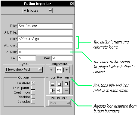
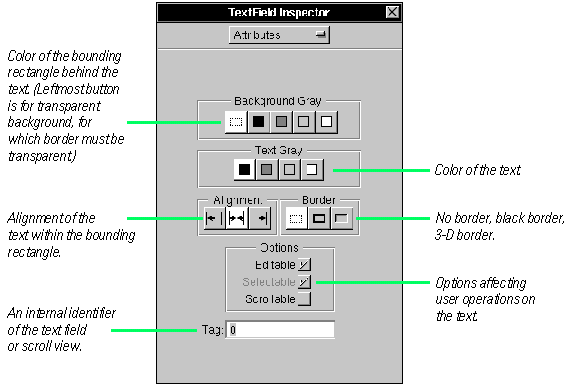
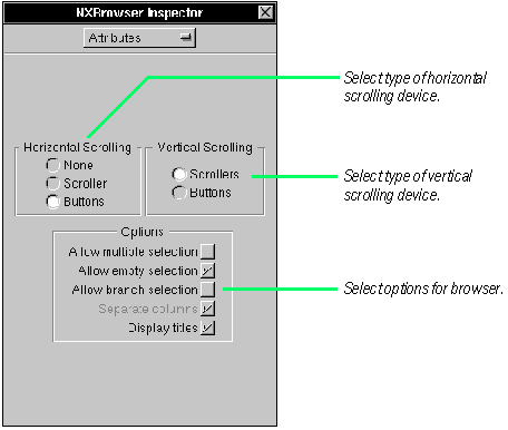
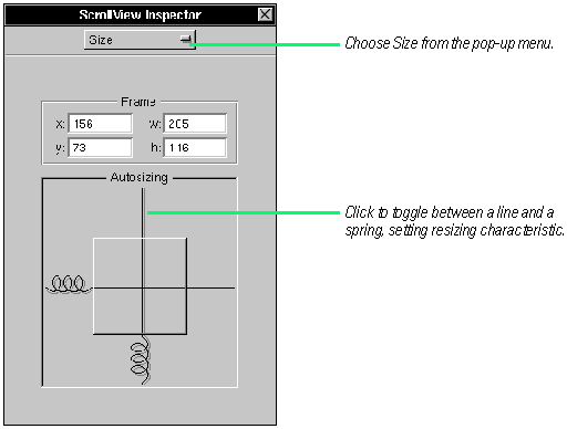
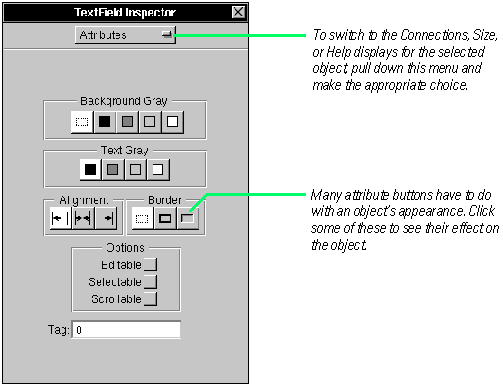
| When you resize a window, the View objects in the window must often adjust their size or the distances between themselves and other objects. The Size display of the Inspector panel lets you tell a selected object how to resize itself.
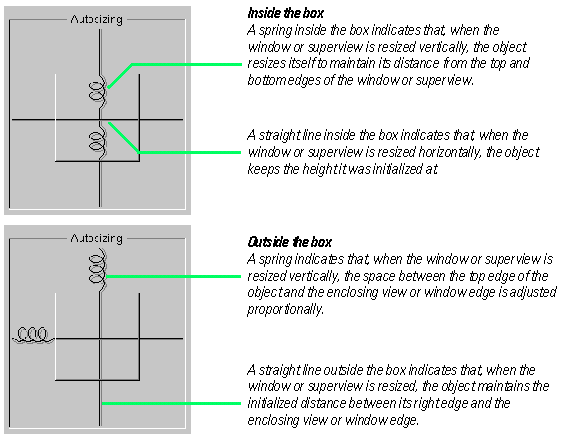
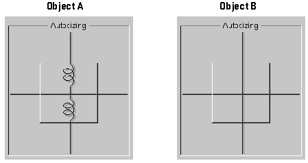
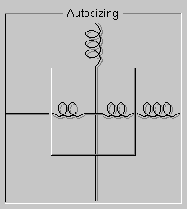
The lines inside and outside the box affect different aspects of resizing behavior.
If you do not make a view resize itself when its superview or window resizes, some ugly behavior could result. For instance, if the user makes a window small, objects that don't resize themselves could become truncated by the resized window's borders..
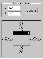
One recourse to this unwanted outcome is to specify a minimum size for the window.
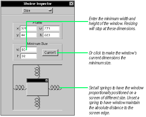
You might need to make several iterations in Interface Builder--setting resizing characteristics in objects and shrinking the window in test mode--to determine what the ideal minimum size should be.
When There Are Conflicts
You can create an impossible resizing relationship, such as specifying as fixed the object's dimensions and its distance from the window's edges. In cases of conflict, an object's fixed dimension takes precedence over its fixed distance from a border. If all dimensions are made resizable, adjustments to the window or superview's changed dimensions are made equally to the object and its distance from a border.
For examples of the effects of these "autosizing" characteristics on views within a resized window, see "Some Effects of Automatic Resizing" on the following pages.
Interface Builder includes a test mode that simulates the actual operation of the inteface. In test mode, you can test the resizing behavior of your windows and views, see how connected objects communicate, play sounds associated with buttons, and do similar operations. Test mode does not test your custom objects or the connections custom objects have with the standard palette objects. See "Testing the Interface" in Chapter 3, "Making and Managing Connections" for more information.

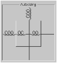
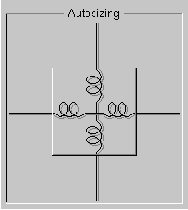
Some Effects of Automatic Resizing
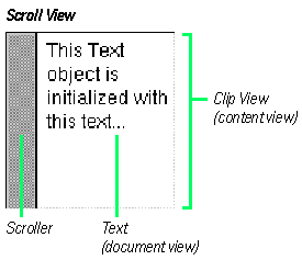
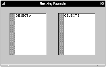
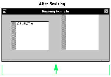
The window below has two identical scroll view objects. Different autosizing "springs" are set in each, and then the window is resized in test mode. The screen shots under After Resizing show you the results.
In the first example, one object resizes vertically while the other doesn't (distances to borders are absolute for both). The result: the object that doesn't resize itself is truncated when the window is vertically shortened.
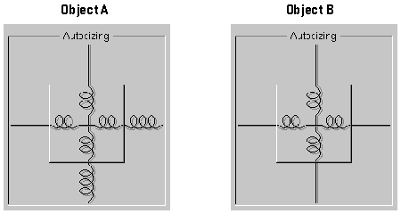
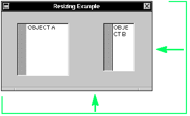
In the second example, both objects resize themselves, but Object B maintains its distance to surrounding objects. This causes Object B to be more severely resized than Object A.
To learn more about the effects of resizing, try some experiments on your own using different combinations of objects and autosizing attributes.
Object Before Resizing
 After Resizing After Resizing

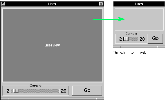
Automatic Resizing: An Example
This example interface (from the Lines sample project) incorporates autosizing attributes in such a combination that the window can shrink to a very small size and still be usable.
Here's how this behavior is aquired:
The window's minimum size is set to a dimension just large enough for the main view to show content and for the slider and button to be manipulated.
The box containing the slider keeps the same distance from the window's adjacent edges, but resizes the gaps between itself and the other views. It resizes itself horizontally, but not vertically:
The button's autosizing attributes complements the box's attributes. It keeps the same distance from the window's adjacent edges, but resizes all other distances. It also resizes itself horizontally, but not vertically:
The main view of the interface (a custom view) maintains a constant distance from the window's edges, but is itself resizable in all directions:
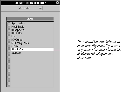
| 