Copyright ©1995 by NeXT Computer, Inc. All Rights Reserved.
| 18 |
Building a Custom Palette
| As you've seen, Interface Builder gives you convenient access to objects defined in the Application Kit: You can drag objects directly from the Palettes window into your application. Through custom palettes, Interface Builder lets you extend this pattern of access to classes of your own design.
A custom palette is a display that can be added to Interface Builder's Palettes window. Each custom palette is represented by its own button at the top of the Palettes window. When the button is clicked, the palette's object or objects appear in the lower portion of the window. Custom palettes can contain subclasses of: |
| Class | Comment | |
| View | Must be dragged into a window | |
| Object | Must be dragged to the File window | |
| Window | Can be dragged and dropped anywhere | |
| MenuCell | Must be dragged into a menu |
| You can manipulate these objects just as you would the objects on the standard palettes. They can be dragged into the application under construction, resized and relocated through direct mouse actions (if they are View or Window objects), and inspected using the Inspector panel. When Interface Builder is put in test mode, objects from custom palettes are fully functional. For example, View objects draw themselves and react to mouse events just as they would in a real application. (This is in contrast to CustomViews, as described in more detail later in this project.)
Custom palettes let you tailor your development environment to suit your needs. They also provide a convenient way to distribute classes to other developers. It's important to note, however, that only classes that meet the following criteria are good candidates for custom palettes. |
|
The class should be designed for reusability. That is, it should be easily adapted for use in a wide range of applications. An object that must be the delegate of the Application object, for example, will be difficult to accommodate in many applications. | |
|
The class should define objects that are useful in a variety of applications. There's little advantage in creating a custom palette for an object that will be used infrequently. | |
|
The class should be thoroughly debugged. The best approach to creating a custom palette for a new class is to first debug the class by building test applications and then, when it's debugged, build the custom palette. |
| This project first describes how to create a simple custom palette and then shows you how to add an inspector for the custom object that the palette contains. Before starting, let's look at how custom palettes fit into the overall structure of Interface Builder. |
| Custom Palettes and Interface Builder |
| The previous projects have demonstrated that you build a NEXTSTEP application by designing its interface, defining your own classes as needed, connecting the components, and then compiling the application. This creates an application that consists of executable code and archived data. At run time, some objects are instantiated directly (such as the Application object) and others are unarchived from nib files.
Interface Builder is no different in the way it is constructed. For example, the first time you click the Scrolling Views button in the Palettes window, Interface Builder loads a bundle containing executable code and archived data for the appropriate objects and displays these objects in the Palettes window. (For information on bundles, see the class specification for NXBundle, a common class.) Adding a new palette to the Palettes window, then, involves creating a type of bundle that Interface Builder can load into itself at run time. This bundle is called a palette file and has a ".palette" extension. Palette files contain archived versions of the objects to be displayed in the Palette window and compiled code to support these objects. A palette file can also contain archived data and object modules for the Inspector associated with a custom palette object. Custom palettes are loaded into Interface Builder dynamically. That is, when a user chooses the Load Palette command from the Tools menu and specifies a palette file, Interface Builder opens the palette file, loads the object modules it contains and then unarchives the objects that will appear in the Palette window. Thereafter, the classes of these custom objects are known to Interface Builder: Their names appear in the proper places in the Classes window, their outlets and actions appear in the Connections Inspector, and Interface Builder can create new objects of these classes as needed. Using Interface Builder's Preferences panel you can have one or more custom palettes loaded automatically whenever Interface Builder is launched. |
| The Custom Object's Design |
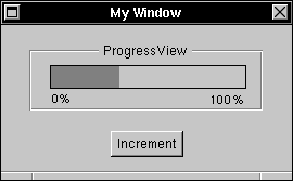
| The palette we'll create in this project contains a single custom object, a ProgressView. A ProgressView reflects the progress of a long-running operation by filling with dark gray an ever increasing proportion of its horizontal extent: |
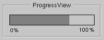 |
| Figure 18-1. ProgressView, Box, and TextField Objects
You could use such an object to inform the user of the status of a long-running calculation, file operation, or other process. A ProgressView responds to an increment: message by increasing the length of the gray bar a predetermined amount. We'll take a closer look at the implementation of the ProgressView class after creating the interface for the custom palette. |
| Creating the Interface |
| The primary component of a custom palette project is a nib file. This file contains the archived object (or objects) that will appear in the palette and a TIFF image that will be used for the button at the top of the Palettes window.
To begin the palette project, start Project Builder and, from the Project menu, choose New. In the panel that appears, drag to Palette in the Project Type pop-up list. Give the project the name "ProgressPalette" and save it in your home directory. The Project window for this project appears. If you browse the Files display of the Project window, you'll find that Project Builder has added these files: |
| File | Description | |
| ProgressPalette.[hm] | Subclass of IBPalette (which is declared in /NextDeveloper/Headers/Apps). For palettes that contain only View objects, nothing must be done to these files. For other types of palettes, one or more methods must be implemented. | |
| ProgressPalette.nib | Interface archive for the palette project. You'll use Interface Builder to modify this template file by adding the objects that will be part of your palette. | |
| palette.table | Loading instructions for Interface Builder. This file becomes part of the palette file package. It tells Interface Builder which icon to display for the palette and which classes to add to the Classes display of the File window, among other things. | |
| Makefile | Standard makefile for palette projects. Project Builder maintains this file; you shouldn't change its contents directly. |
| Double-click the ProgressPalette.nib entry. Interface Builder starts and displays the contents of this template file: a File's Owner object, the first responder, and a window titled "Palette View". Using Interface Builder's Inspector window, you can verify that the File's Owner object in the File window is an object of the ProgressPalette class. If you switch to the Connections display, you'll see that the originalWindow outlet, which the File's Owner inherits from its parent class, is already attached to the panel. When Interface Builder loads a palette file, it uses this connection to find the View objects that it must extract from the nib file and position within the Palette window.
The next step is to put a ProgressView object in this panel; however, at this point the ProgressView class is unknown to Interface Builder. Interface Builder provides a generic View, the CustomView object, for these situations. A CustomView object records the location, width, height, and class of a View of your own design. At run time, when objects are unarchived from the nib file, an object of the class you specified is created in place of the CustomView. The View that's created is positioned and resized to match the position and dimensions of the CustomView in the nib file, and its drawSelf:: method is invoked to cause it to display itself. Drag a CustomView (from the Basic Views palette) into the panel and resize it to look like this: |
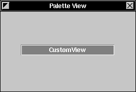 |
| Figure 18-2. Building the Custom Palette
Now add a label to this CustomView by dragging a TextField titled "Title" from the Palette window into the panel. Change the TextField to read "0%" and use the Font panel to decrease the font size. Make a second label by copying and pasting the one you've just created and then change the title to read "100%". Position these titles at opposite ends of the CustomView. Finally, create a box around the CustomView and the titles by selecting the three objects and choosing the Group command from the Layout menu. Change the title of the box to read "ProgressView". |
| Defining the ProgressView Class |
| The next step is to reassign the class of the CustomView to the as-yet-unwritten ProgressView class. To do this, you must first use the Classes display of the File window to define the ProgressView class.
Switch to the Classes display and select View in the class hierarchy. Create a subclass of View by dragging to Subclass in the Operations pull-down list. A new class titled "MyView" appears in the hierarchy. Using the Class inspector, change the name of this class to "ProgressView" and press Return. A ProgressView responds to a single action method: increment:. Using the Class inspector, add this method to those listed under the Actions button. Now, let's create template source files for the ProgressView class. Drag to Unparse in the Operations pull-down list in the File window. In the first panel that appears, confirm that you want to create ProgressView.h and ProgressView.m. In the second panel, confirm that you want these files added to the project. We'll fill in these template files later. Finally, reassign the class of the CustomView in the panel. Select the CustomView. Note that the CustomView is grouped within a Box object (that is, it's within the Box's view hierarchy). Clicking the box selects the Box object. To move the focus of selection to the objects inside the box, double-click within the box. Now select the CustomView by clicking it. Using the Attributes display of the CustomView Inspector, locate ProgressView in the list of classes it contains. Click this entry, and the label in the CustomView changes to "ProgressView". |
| Providing An Image for the Palette's Button |
| The ProgressView custom palette needs an image for its button in the Palettes window. You can either use the IconBuilder application (in /NextDeveloper/Apps) to create a new one, or you can use ProgressPalette.tiff, which you'll find in /NextLibrary/Documentation/NextDev/Examples/IBTutorial/Images. (If you create your own image, make sure it's no larger than 48 by 48 pixels and that its background is transparent.)
Drag the image's file icon from the Workspace Manager File Viewer into Project Builder's Project window. As you drag the icon into the window, a suitcase opens to accept it. When you release the icon, the image is added under Images in the Files display. Now save the project. When the project is saved, Interface Builder is alerted to any changes it contains. Now if you look in the Images display of Interface Builder's File window, you'll see the new image. The custom palette's interface is complete. The next step is to write the class definition files for the ProgressView class. Before continuing to the next step, save the nib file you've created. |
| Writing the ProgressView Class Files |
| The files that Interface Builder has created for the ProgressView class contain only template code for the increment: action method. You'll have to finish this method's implementation and add the other methods described in this section. (If you're reading an electronic version of this tutorial, you can simply copy the code listed below and paste it into the appropriate ProgressView source file in your project.)
ProgressView.h This file declares the interface to the ProgressView class. |
 #import <appkit/appkit.h>
#define DEFAULTSTEPSIZE 5
#define MAXSIZE 100
@interface ProgressView:View
{
int total, count, stepSize;
float ratio;
}
- initFrame:(const NXRect *)frameRect;
- drawSelf:(const NXRect *)rects :(int)rectCount;
- setStepSize:(int)value;
- (int)stepSize;
- setRatio:(float)newRatio;
- increment:sender;
- read:(NXTypedStream*)stream;
- write:(NXTypedStream*)stream;
@end
| The file starts by importing the standard header file for the Application Kit. Then, two constants are defined. DEFAULTSTEPSIZE is the value that's added to a running total each time an increment: message is received. MAXSIZE is the maximum length of the bar.
Next, the ProgressView class declares four instance variables: |
| Variable | Description | |
| total | Total length of bar; MAXSIZE in this example | |
| count | Running total; incremented by each increment: message | |
| stepSize | Amount to add to count upon receiving an increment: message | |
| ratio | Proportional length of dark gray portion of bar (count/total) |
| Finally, ProgressView's methods are declared. These methods are discussed in the next section.
ProgressView.m This file contains the implementation of the methods declared in ProgressView.h. |
#import "ProgressView.h"
@implementation ProgressView
- initFrame:(const NXRect *)frameRect
{
[super initFrame:frameRect];
total = MAXSIZE;
stepSize = DEFAULTSTEPSIZE;
return self;
}
- drawSelf:(const NXRect *)rects :(int)rectCount
{
PSsetgray(NX_LTGRAY);
NXRectFill(&bounds);
if (ratio > 0) {
NXRect r = bounds;
r.size.width = bounds.size.width * ratio;
PSsetgray(NX_DKGRAY);
NXRectFill(&r);
}
PSsetgray(NX_BLACK);
NXFrameRect(&bounds);
return self;
}
- setStepSize:(int)value
{
stepSize = value;
return self;
}
- (int)stepSize
{
return stepSize;
}
- setRatio:(float)newRatio
{
if (newRatio > 1.0) newRatio = 1.0;
if (ratio != newRatio) {
ratio = newRatio;
[self display];
}
return self;
}
- increment:sender
{
count += stepSize;
[self setRatio:(float)count/(float)total];
return self;
}
- read:(NXTypedStream*)stream
{
[super read:stream];
NXReadTypes(stream, "ii", &total, &stepSize);
return self;
}
- write:(NXTypedStream*)stream
{
[super write:stream];
NXWriteTypes(stream, "ii", &total, &stepSize);
return self;
}
@end
| ProgressView.m starts by importing ProgressView.h for the interface to its own class. The rest of the file contains the implementation of ProgressView's methods: |
| Method | Description |
| initFrame: | Initializes a newly allocated ProgressView by setting the values of its total and stepSize variables. Its count and ratio instance variables are automatically initialized to 0. | |
| drawSelf:: | Draws the ProgressView by first filling its entire bounds rectangle with light gray, determining which portion of the bounds should be filled with dark gray and painting that portion, and finally drawing a black border around the entire ProgressView. | |
| setStepSize: | Sets the amount to be added to count when the ProgressView receives an increment: message. (This method will be used in the next project.) | |
| stepSize: | Returns the amount to be added to count when the ProgressView receives an increment: message. (This method will be used in the next project.) | |
| setRatio: | Sets the ratio variable and then redisplays the ProgressView (thus causing the drawSelf:: method to be invoked). | |
| increment: | Increases the value of the count variable by adding stepSize to it. This method then invokes the setRatio: method, using the ratio of count to total as the argument. | |
| read: | Reads the archived values of the total and stepSize variables from a typed stream. | |
| write: | Writes the values of the total and stepSize variables to a typed stream. |
| At a minimum, a custom palette object must be able to draw, archive, and unarchive itself; thus, the drawSelf::, write:, and read: methods above. The other methods are peculiar to the ProgressView class and aren't required by all custom palette objects.
The drawSelf:: method is invoked when the palette is first loaded, to draw the ProgressView in the Palettes window. It's also invoked when you put Interface Builder in test mode and there's a ProgressView object in your application's window. Of course, when an application that contains a ProgressView is run, drawSelf:: is invoked whenever the ProgressView needs to draw itself, such as after it receives an increment: message. The read: and write: methods are needed so that the ProgressView can be archived. When you create the custom palette, the ProgressView object must archive itself into the palette file. When the custom palette is loaded into Interface Builder, the ProgressView is unarchived from the palette file. The process of unarchiving involves allocating enough memory for the object and then sending it a read: message so that it can initialize its variables from the values stored in the archive. In unarchiving, the initFrame: method, which would normally establish the values of the total and stepSize variables, isn't invoked. Thus, the read: method must establish those values. The matching write: method records the values of total and stepSize in the archive file when the palette is created. Without these methods, a newly unarchived ProgressView would have 0 as the values of total and stepSize. Whenever you create a class that you intend to use in a custom palette, remember to implement read: and write: methods to archive the variables whose values you want to store along with the object. |
| Updating the palette.table File |
| Before you can compile the palette project, you must update the palette.table file. Interface Builder consults this table when it loads a palette file. It uses the information from the table to identify and instantiate the nib file's owner, to display the proper image for the button in the Palette window, and to insert class names within the Classes display of the File window, among other things.
Locate palette.table under Other Resources in Project Builder's Project window. Double-click the entry to reveal the file's contents: |
Class = ProgressPalette; /* (a subclass of IBPalette) */
NibFile = ProgressPalette; /* (a nib file name) */
/* Icon =; (a tiff/eps file name) */
/* ExportClasses = (); (a list of class names) */
/* ExportImages = (); (a list of icon names) */
/* ExportSounds = (); (a list of sound names) */
| The first two lines identify the names of the class of the nib file's owner and of the nib file itself. The remaining lines can be used to identify other elements of the palette file. For this project, you need to specify the name of the image to be used for the Palette window button and to specify the name of the class, ProgressView, that should be added to the Classes browser. Make the changes that appear in bold below: |
Class = ProgressPalette; /* (a subclass of IBPalette) */
NibFile = ProgressPalette; /* (a nib file name) */
Icon = ProgressPalette; /* (a tiff/eps file name) */
ExportClasses = (ProgressView); /* (a list of class names) */
/* ExportImages = (); (a list of icon names) */
/* ExportSounds = (); (a list of sound names) */
| After you've made these changes, save and close palette.table. |
| Compiling and Loading the Palette |
| You're now ready to compile the custom palette. Switch to Project Builder's Builder display and click the Build button. When the process is finished, a file with the name ProgressPalette.palette is added to the project directory.
To load the custom palette, choose Interface Builder's Load Palette command from its Tools menu. In the Open panel that appears, select that palette file and click OK. After a moment, Interface Builder's Palette window is updated to show the new palette. |
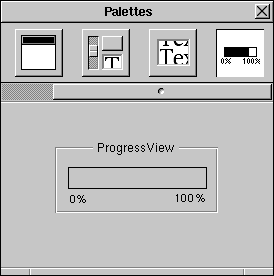 |
| Figure 18-3. ProgressView Custom Palette
Notice that a horizontal scroller appears to give you access to palette buttons that no longer fit within the Palettes window. |
| Testing the Palette |
| Now that a ProgressView is available from within Interface Builder, it's easy to test its operation. Close the palette project by closing the Project window for the ProgressPalette project. Now, start a new project by choosing New in Project Builder's Project menu. In the panel that appears, name the project "Test" and make sure the Project Type button reads "Application". Finally, open the nib file.
In Interface Builder, drag a ProgressView object from the Palettes window into the application's window. To test the ProgressView's operation, you have to send it increment: action messages. Add a button to the window and change its title to "Increment". Control-drag a connection from the button to the ProgressView. (Make sure the connection is made to the ProgressView and not to the Box that surrounds it--check the Connections list in the Connections Inspector to confirm the identity of the destination object.) Using the Connections Inspector, specify that the Button sends an increment: message to the ProgressView. Finally, test the ProgressView by putting Interface Builder in test mode and clicking the Increment button. The gray bar should step across the ProgressView with each click. If nothing happens, quit the test mode, recheck the connection between the button and the ProgressView, and try again. |
| Using Custom Palette Objects in Other Applications |
| Building an application using a custom palette object is in most respects identical to building one using the standard objects that are available within Interface Builder; the few differences are described here.
You've demonstrated that the ProgressView custom object works within Interface Builder's test mode. However, if you compile the new application and attempt to run it, this error appears in the Workspace Manager Console window: |
> objc: class `ProgressView' not linked into application
> An uncaught exception was raised
> Typed streams library error: class error for 'ProgressView': class not loaded
| The problem is that although the application's nib file contains an archived ProgressView object, the ProgressView class hasn't been linked into the application. Thus, none of the ProgressView's methods can be invoked.
There are several ways to ensure that the ProgressView class is linked into an application. The easiest is to add the ProgressView class files (ProgressView.h and ProgressView.m) to the list of class files in Project Builder's Files window. For your own applications, this is a reasonable solution. If, however, you don't want to distribute source code along with the custom palettes you develop, you can either distribute object files (in this case, ProgressView.o) or a library containing object modules for your custom classes. The object files or library can be added to the appropriate list in Project Builder. Another consideration when developing applications using custom palettes concerns the editing of nib files. If you create a nib file that contains a custom palette object, that interface file can be opened only by a similarly configured Interface Builder application. In other words, if the nib file contains a ProgressView, then you will have to load the ProgressView palette before you'll be able to open the nib file. As normally configured, Interface Builder won't have access to the class information for the custom object. |
| Adding a ProgressView Inspector |
| A palette file can provide Attribute, Connection, Size, and Help inspectors for the custom objects it contains. (Custom Connection and Help inspectors are rarely needed, however.) For example, when a user attempts to display the Attributes inspector associated with the custom object (say, by selecting the object and choosing Inspector from the Tools menu), Interface Builder loads the inspector and uses it as the Attributes display of the Inspector window. For example, an Attributes Inspector for the ProgressView class might look like this: |
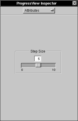 |
| Figure 18-4. ProgressView Inspector
An Attributes Inspector typically lets a user set an object's characteristics that can't be set through direct mouse manipulation. For example, the ProgressView Inspector pictured above lets the user adjust a ProgressView's stepSize variable, thus determining the amount the dark gray bar advances across the ProgressView with each increment: message. Inspectors can have OK and Revert buttons, although they aren't required. If the user adjusts the controls in an inspector and then clicks Revert, the changes are discarded and the previous values are reestablished; if the user clicks OK, the new values are sent to the object that's being inspected. Interface Builder identifies the appropriate inspector to display for a selected object by sending the object one of these messages, depending on the setting of the pop-up list in the Inspector window: |
getInspectorClassName
getConnectInspectorClassName
getSizeInspectorClassName
getHelpInspectorClassName
| The getInspectorClassName message is sent to determine the name of the class of the Attributes inspector. For example, the ProgressView class could implement this method this way: |
- (const char *)getInspectorClassName
{
return "ProgressViewInspector";
}
| Since each custom object can identify its inspector, a custom palette file can contain multiple classes of objects, each with its own inspector.
Another benefit of this system of identifying an object's inspector is that inspectors are inherited. Interface Builder provides inspectors for each of the classes represented in the Palettes window. If you create a subclass of one of these classes and don't implement the inspectorName: method, Interface Builder will display the superclass's inspector whenever the custom object is inspected. For debugging purposes, it's often better to create the inspector for an object only after the object itself has been debugged and placed in a custom palette. This is the approach we take in this project. Now that ProgressView objects are available through a custom palette, we'll create a simple inspector for the ProgressView class. |
| Designing the ProgressView Inspector |
| Creating an inspector for a custom palette object is much like creating the custom palette itself. You start by assembling an interface for the custom object inspector. The owner of this nib file is an object you define that translates actions taken on this interface into messages to send to the object that's being inspected. The class files for the owner object and the inspector's nib file are added to the palette project and compiled into the palette file along with the custom palette object. Let's start by assembling the inspector's user interface.
Interface Builder provides a New Inspector command for our purposes. Choose the New Module command in the Document menu and, in the menu that appears, choose New Inspector. A new File window and a panel titled "Inspector" appear. Now, let's add some objects to the panel. Drag a horizontal slider into the panel and then add labels for each end (as in Figure 18-4 above). Edit the left label to read "0" and the right one "10". Calibrate the slider to these values by using the Slider Inspector to set its minimum value to 0 and the maximum value to 10. Set the current value to 5 and press Return. Add an editable text field above the center of the slider. This text field will read out the slider's current setting. Resize the text field to accommodate two-digit numbers and then edit its contents to read "5". Using the Alignment group of buttons in the TextField Inspector, specify that the TextField's display is right aligned: |
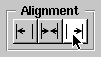 |
| Figure 18-5. Setting the Alignment of the TextField
Finally, select all the objects in the panel and choose the Group command from the Layout menu (a submenu of the Format menu) to surround them in a box. Edit the box's title to read "Step Size". The interface to the ProgressView inspector is complete. Save the interface in a file called ProgressViewInspector.nib--the Open panel will suggest saving the nib file in the proper language directory of the ProgressPalette project--and, when the attention panel appears, confirm that you want the file added to the project. |
| Designing the ProgressViewInspector Class |
| The interface that you just created will act on a selected object through the intervention of a ProgressViewInspector object, which we will now define.
Inspectors inherit from Interface Builder's IBInspector class, a subclass of Object. (See /NextDeveloper/Headers/apps/InterfaceBuilder.h for the class interface to the IBInspector class.) The IBInspector class has these important outlets: |
| Outlet | Description | |
| object | id of the object that's being inspected | |
| window | id of the Panel that contains the inspector's user interface | |
| okButton | id of the OK button, if present | |
| revertButton | id of the Revert button, if present |
| The IBInspector class adopts the IBInspectors protocol, which declares these methods: |
| Method | Description | |
| ok: | Sets the inspected object to reflect the user's choices in the Inspector panel. | |
| revert: | Cancels any pending changes to the inspected object. This method is also invoked when the Inspector is first instantiated. | |
| wantsButtons: | Invoked by Interface Builder to determine if OK and Revert buttons should be displayed for this inspector. |
| Let's create a subclass of IBInspector for our inspector. The IBInspector class is listed under Object in Interface Builder's Classes browser. Select this entry and drag to Subclass in the Operations pull-down list. In the Class inspector, rename this new class "ProgressViewInspector". Note that the Class Inspector reports that the ProgressViewInspector class inherits the window outlet and ok: and revert: methods of its superclass. A ProgressViewInspector needs two more outlets, which it will use to communicate with the slider and text field in its user interface. Add these outlets and name them theSlider and theTextField.
Now, create template source files for the ProgressViewInspector class. Drag to Unparse in the Operations pull-down list of the Classes display. In the first panel that appears, confirm that you want to create ProgressViewInspector.h and ProgressViewInspector.m. In the second panel, confirm that you want to add these files to the project. We'll fill in these template files later. Next, reassign the class of the File's Owner object to the ProgressViewInspector class. Select the File's Owner object in the Objects display of the File window. In the File's Owner Inspector panel, select ProgressViewInspector. Finally, save the nib file. |
| Connecting the Objects |
| The File's Owner, a ProgressViewInspector, must be connected to its user interface objects. Control-drag a connection from the File's Owner to the Slider and connect the two using the theSlider outlet. Similarly, connect the File's Owner to the TextField using the theTextField outlet. Notice that Interface Builder has already connected the File's Owner and the inspector panel using the window outlet. All inspectors are connected to their user interfaces through this outlet.
The Slider and the TextField must also be connected to the File's Owner so that actions taken on these controls are reflected in the object being inspected. Control-drag a connection from the Slider to the File's Owner, and using the Connections inspector, make the File's Owner the target of an ok: message from the Slider. Similarly, make the TextField send an ok: message to its target, the File's Owner. These are the only connections you need to make. When the inspector is being used in Interface Builder, its object outlet will be set automatically to the id of the object that's currently being inspected. When the user clicks OK or Revert in an inspector that has these buttons, Interface Builder will send the appropriate message to the ProgressViewInspector object. |
| Editing the ProgressViewInspector Class Files |
| The next step is to fill in the template class files that Interface Builder has added to the project. The finished files are listed here. (If you're reading this on-line, you can copy the listings into the template files in your project.) A description of the files follows each listing.
ProgressViewInspector.h This file declares the interface to the ProgressViewInspector class. |
#import <apps/InterfaceBuilder.h>
@interface ProgressViewInspector:IBInspector <IBInspectors>
{
id theSlider;
id theTextField;
}
- init;
@end
| The file starts by importing InterfaceBuilder.h, which contains the declaration of the IBInspector class, ProgressViewInspector's superclass. Note that the ProgressViewInspector class adopts the IBInspectors protocol, which declares the ok:, revert: and wantsButtons: methods.
This interface file then declares two instance variables, theSlider and theTextField. These variables correspond to the two outlets that you added using Interface Builder's Class Inspector. Finally, the file declares the init method, which is described in the next section.
ProgressViewInspector.m This file contains the implementation of the methods declared in ProgressViewInspector.h. |
#import "ProgressViewInspector.h"
#import "ProgressView.h"
@implementation ProgressViewInspector
- init
{
char buf[MAXPATHLEN + 1];
id bundle;
[super init];
bundle = [NXBundle bundleForClass:[ProgressView class]];
[bundle getPath:buf
forResource:"ProgressViewInspector"
ofType:"nib"];
[NXApp loadNibFile:buf
owner:self
withNames:NO
fromZone:[self zone]];
return self;
}
- ok:sender
{
if (sender == theSlider) {
[object setStepSize:[theSlider intValue]];
[theTextField setIntValue:[theSlider intValue]];
}
else if (sender == theTextField) {
[object setStepSize:[theTextField intValue]];
[theSlider setIntValue:[theTextField intValue]];
}
return [super ok:sender];
}
- revert:sender
{
int step;
step = [object stepSize];
[theSlider setIntValue:step];
[theTextField setIntValue:step];
return [super revert:sender];
}
- (BOOL)wantsButtons
{
return NO;
}
@end
| The init method initializes a newly allocated ProgressViewInspector. As in all init... methods, the chain of initializations is maintained through a message to the superclass (IBInspector) to initialize itself.
Next, the inspector's user interface is loaded from the appropriate nib file; however, since the palette file could be located anywhere, you have to enlist the services of an NXBundle object to find the proper directories to search. The NXBundle object is initialized on the directory that provided the code for the ProgressViewInspector class. Given the user's language preferences, the nib file will be sought in one of its subdirectories (for example, English.lproj, French.lproj, etc.). In contrast, if you were to try to load the nib file by sending a loadNibFile:... message, Interface Builder's file package would be searched for the nib file. (See the NXBundle class specification for more information.) When the nib file is loaded, the inspector's theSlider and theTextField outlets are automatically initialized to the id's of the appropriate objects from the nib file. (In addition, the ProgressViewInspector's object outlet is set to the id of the ProgressView that the user has selected.) The ok: and revert: methods synchronize the values in the inspector panel with each other and with the object being inspected. When a user acts on the slider, for example, an ok: message is sent to the ProgressViewInspector. The inspected object's step size is set to the value of the Slider object, and then the TextField's value is made to match that of the Slider. The revert: method asks the selected ProgressView for its current step size and then sends messages to the Slider and TextField to reflect this value. The implementation of each method ends by invoking the IBInspector class's implementation of the identical method: |
return [super ok:sender];
return [super revert:sender];
| In the ok: and revert: methods of inspector classes you write, remember to invoke the IBInspector class's ok: and revert: methods, as demonstrated here. This is required for the correct operation of inspectors.
Besides being sent when the user clicks Revert, a revert: message is sent to the ProgressViewInspector whenever the user selects a ProgressView and the inspector is open. This lets the inspector update its controls so that they reflect the state of the inspected object. Interface Builder sends a wantsButtons: message to the ProgressViewInspector to determine if OK and Revert buttons should appear in the Inspector panel. Most Inspectors won't need these buttons; rather, a user's actions in the panel will immediately and visibly change the state of the inspected object, as in this example. |
| Modifying the ProgressView Class Files |
| As mentioned earlier, Interface Builder identifies the inspector for a selected object by sending the object an inspectorName message. Since you've created an inspector for ProgressView objects, it's time to add this method to the ProgressView class files.
In ProgressView.h, add this declaration: |
- (const char *)getInspectorClassName;
| In ProgressView.m, add the implementation of the inspectorName method: |
- (const char *)getInspectorClassName
{
return "ProgressViewInspector";
}
| Compiling and Testing the Inspector |
| After saving the class and nib files, use Project Builder's Build command to compile the project. When the process is finished, you can load the new palette file, ProgressPalette.palette. (Remember that only one version of a given palette can be loaded at a time. If you already have an older version of the ProgressView palette loaded, you'll have to restart Interface Builder in order to load the new version.)
Once the custom palette is loaded, test its operation by creating a new application that contains a ProgressView and a button, as illustrated here: |
 |
| Figure 18-6. Testing the ProgressView Inspector
Use the ProgressView Inspector to set the step size, and then put the application in test mode to test the ProgressView's operation. If the inspector doesn't appear when you attempt to inspect a ProgressView, recheck the connections in the ProgressViewInspector nib file. (Especially check that the window outlet is connected to the panel that contains the inspector's user interface). |